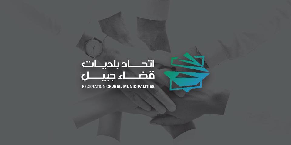
Today, before we move to the new premises of the federation of municipalities of caza de jbeil, we launch our new logo. A logo designed and directed by miss michèle m. Khalife, specialized in graphic design. A logo that, as you can see, is simple and direct at a time. He then transposes the message we want to bring to the Federation: that of fusion, synergy, meeting, in the heart of our dear cedar, an indelible symbol of Lebanon.
A logo is never arbitrary, it is always thought and rethought in its smallest details, shapes, colors, features, fonts. Thought and worked to match and refer to the image of the institution he represents, because he is supposed to summarize it in a figure that equals a thousand words, a thousand images, a thousand ideas.
This merger of the municipalities of caza caza within the federation is reflected graphically by the subtle fusion of two squares, as to exacerbate the already powerful symbolic of this geometric form of the square. Symbol of rigour and seriousness, image of structure and order, the square also represents human construction. And The Federation is precisely this overlapping, this osmosis of the human capacities of our administrations that constitute our added value. Slightly crooked, these two squares inspire movement, dynamism, a federation that prides itself on being always on the move, in perpetual evolution, for the sake of the well-being of the administered
Moreover, the image that accompanies the logo, these arms and its attached hands, illustrates the famous saying that the union is making strength. And precisely, the union of the municipalities of the caza de jubayl is the strength of our federation
Playing the geometric classicism of the square and the contemporary aspect in which he loves himself, the federation logo is in the image of the institution he represents: feet firmly anchored in his past, in his history, in his heritage, but The look towards the future, towards distant horizons.
In the fusion of squares, the fusion of colours is added; only two colours are used, green and blue. In the image of the detailing lines of our logo, the use of these two unique colours is direct references to the green of our mountains and to the blue of our sea that spread throughout the caza of jbeil. Our Mountain and sea, these gifts of nature where we draw our strength and which constitute a source of serenity, healing and fullness. Where everything starts and where it all ends.
The past and the present join, the mountain merges with the sea, the municipalities of the caza of jbeil unite, all under one banner, the cedar, the emblem of the nation that is always within reach and heart. In the way the two squares intertwine, it is the cedar that emerges, perennial, unfading. Our Cedar, our homeland, in the heart of our federation.
To benefit from our services, Contact us
|